Support
Our support team is ready to assist with any questions while using our apps.
The Cart Settings page allows you to configure the general appearance and behavior of your cart drawer. Access it from the dashboard’s Quick Actions section or through the main navigation menu.
This section shows whether the Cart Upsells cart drawer is active on your store’s theme.
If the status shows “Disabled”, click the link to open your Theme Editor and toggle on the app embed.
Configure the core behavior and layout of your cart drawer.
Choose which side of the screen the cart drawer appears from:
Select the position that best matches your store’s layout and user experience.
Select the visual style of your cart drawer:
Control how much horizontal space your cart drawer occupies:
Choose how the empty cart state appears:
Display a floating cart button that remains visible across the storefront and follows the user while scrolling. Customers can open the cart drawer from anywhere on the page without cluttering your header or navigation.
Toggle the floating cart button on or off. When enabled, a cart icon will appear on your storefront that customers can click to open the cart drawer.
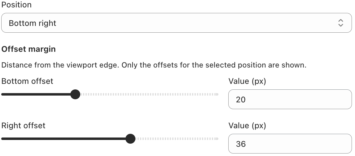
Choose where the floating cart button appears on the screen:
Control the distance from the viewport edge. Only the offsets for the selected position are shown (e.g. Bottom and Right when “Bottom right” is selected). Adjust the sliders or enter values in pixels to fine-tune the button placement.
Choose a pre-made icon or upload your own to represent the cart button.
Customize the visual appearance of the floating cart button.
Add a subtle shadow to the floating button. When disabled, the button appears flat.
Set the background color of the floating button.
Display the number of items in the cart on the floating button. When enabled, a badge appears on the button.
Floating cart button demonstration:
Customize the text and imagery shown when customers have no items in their cart.
Upload a custom icon or image for the empty cart state.
The main heading shown in the empty cart.
Descriptive text that appears below the title.
The call-to-action button text that encourages customers to start shopping.
Additional information shown at the bottom of the empty cart, such as shipping or return policies.
After making changes, use the Save button in the save bar at the top of the page to apply your settings. Click Discard to revert to the previously saved values.